

Colour is a power that directly influences the soul. Wassily Kandinsky
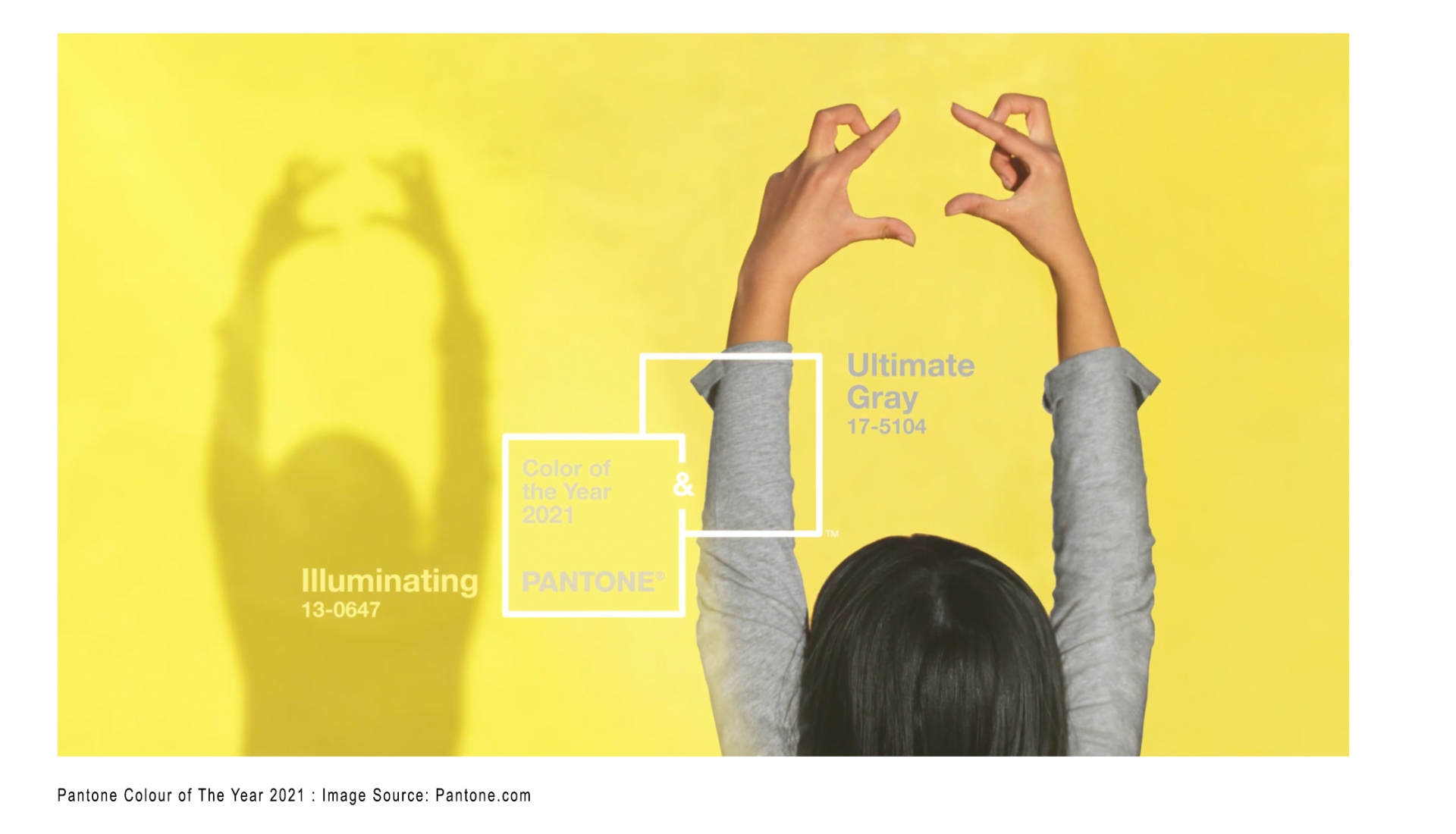
In 2021 the Pantone colour of the year is in fact two colours: PANTONE 17-5104 Ultimate Grey and PANTONE 13-0647 Illuminating, two independent colours that highlight how different elements can come together to support one another. Chosen as an antithesis to the current gloomy Covid19 and general global stress. PANTONE 17-5104 Ultimate Grey is practical and rock solid whereas the yellow PANTONE 13-0647 Illuminating is warming and optimistic. Combined they “encapsulate feelings of thoughtfulness with the promise of something sunny and friendly.” Leatrice Eiseman, Executive Director of the Pantone Color Institute.
 In terms of interior design and tile selection, colour really matters. It affects our mood and outlook, often in ways we can’t imagine. Yellow is widely recognized as the happiest colour in the world. It evokes feelings of warmth, positivity and optimism. It is also known to increase mental activity, heightened awareness, increased energy levels and metabolic rate. (Kelly 2019) Yet too much yellow can actually cause some people to have feelings of frustration and anger, and heightened levels of aggression and agitation.
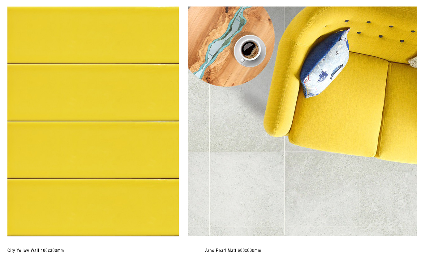
Grey represents neutrality and balance, intellect and promise but like all colours, also has negative connotations particularly in relation to being considered dull and cold, and associated with depression and loss. Used in combination however, yellow and grey are really harmonious. The calmness of grey tones down the strength of yellow, and in return the uplifting sunny tones of yellow gives grey a personality and energy it doesn’t have on its own.
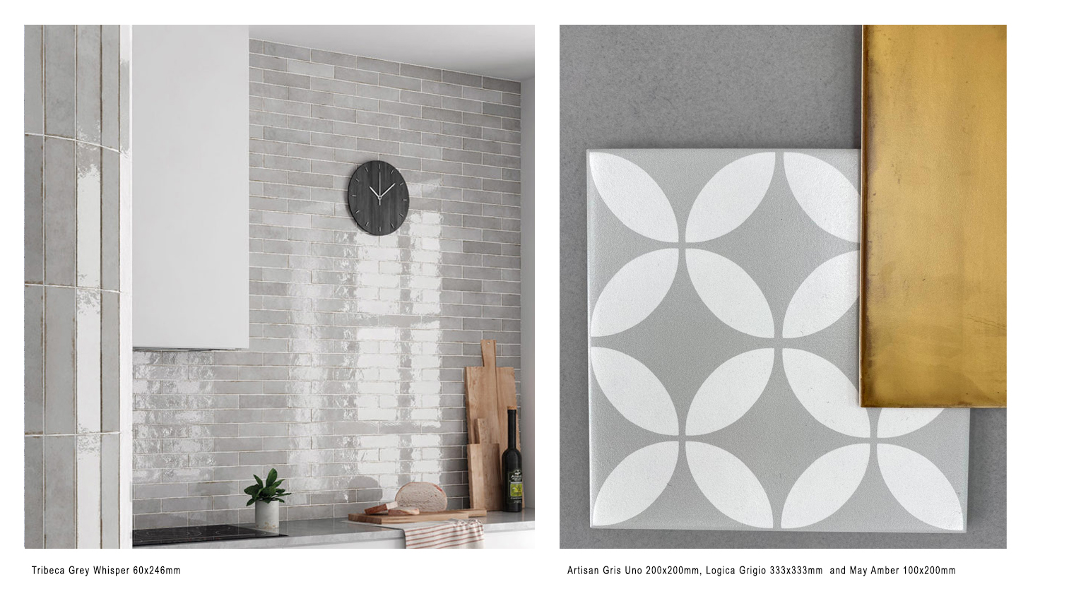
At the Tile Depot, grey tiles are consistently the most popular colour chosen throughout residential and commercial spaces. Grey makes the perfect contemporary neutral and is the ideal backdrop to introduce pops of colour. Being neutral, grey works with almost any secondary colour, especially bright colours like yellow that can really inject some zing into a space.
In 2021 the softer greys, particularly those that replicate natural stone or have interesting patterns and textures: such as the terrazzo effect or artisan patterned tiles are proving to be the most sought after, particularly for larger areas of floor. Where grey is used on the walls it if often with a simpler, plainer design and we are noticing a real increase in the use of subtle shade variation and high gloss finishes.
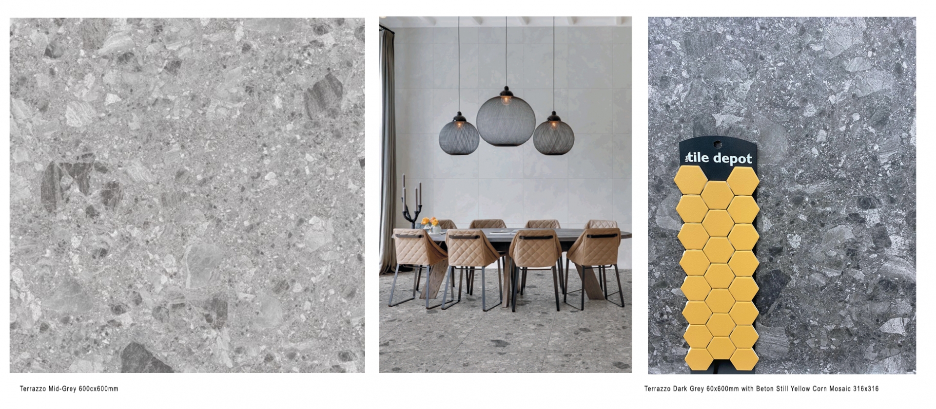
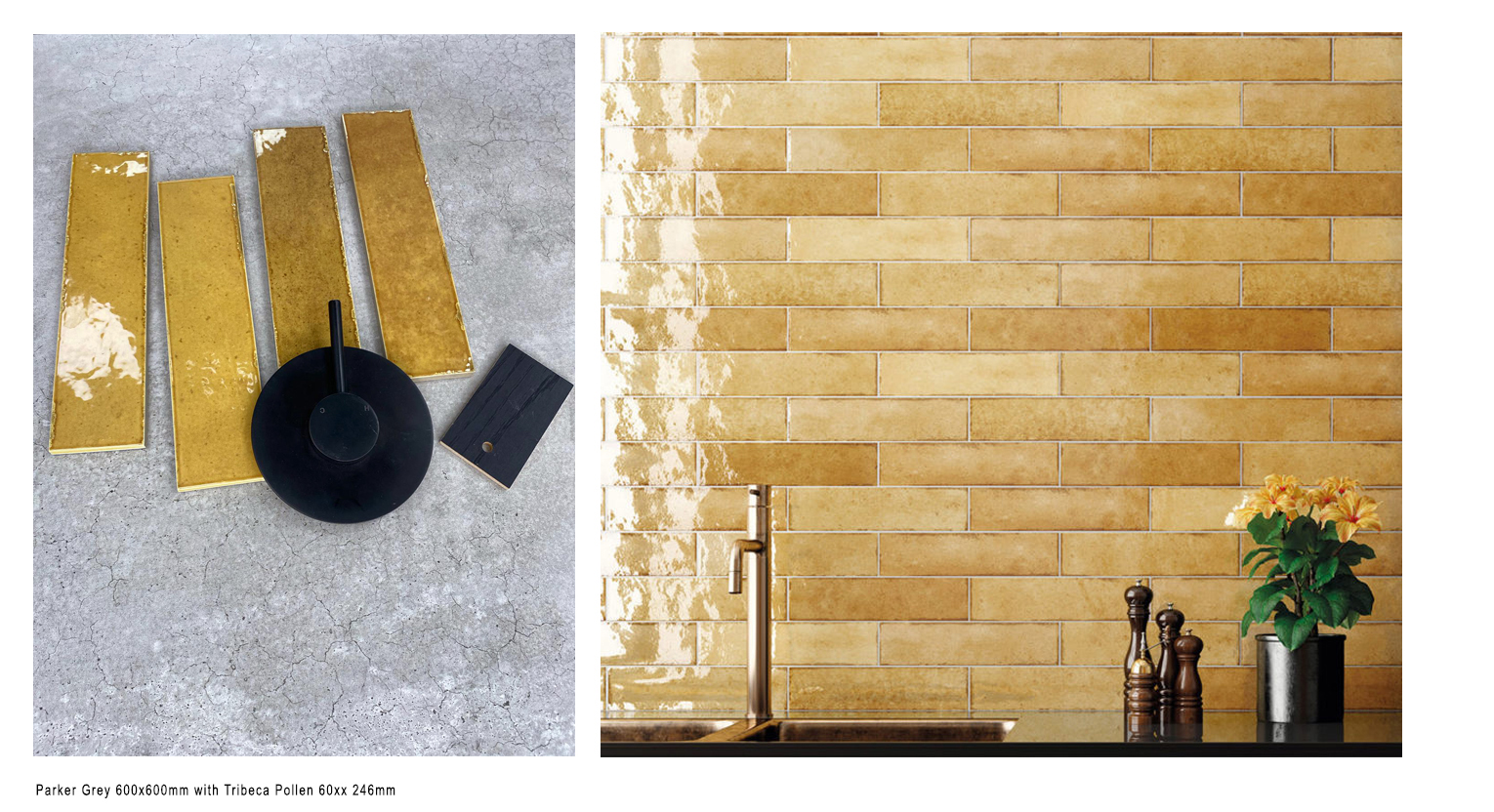
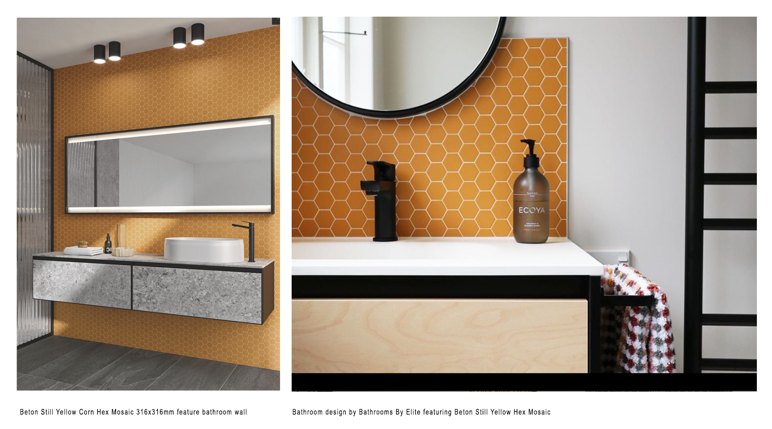
In terms of yellow tiles, it is the more mustard tones rather than Pantones Illuminating yellow that are really being sought, often as feature walls in bathrooms and splash backs in kitchens and laundries. Almost always used with grey on floors and surrounding walls. Black used on detailed elements such as tapware, towel warmers and trims is often used in conjunction with the grey and golden tiles.
Traditionally grey is for those who like to play it safe and chic, yellow is for those who aren’t afraid to be bold and out there. Used in conjunction, they have a very contemporary effect. If you’re feeling inspired, head into your nearest Tile Depot store and our staff can help you find the right balance of grey and yellow for your next project and introduce you to a wide range of design options.